Front Page Construction
- This is my original page with no picture or text placed on it, I chose to keep the original measurements Photoshop gave me for the page as it was the most realistic shape for the front cover of a music magazine through it being rectangular.
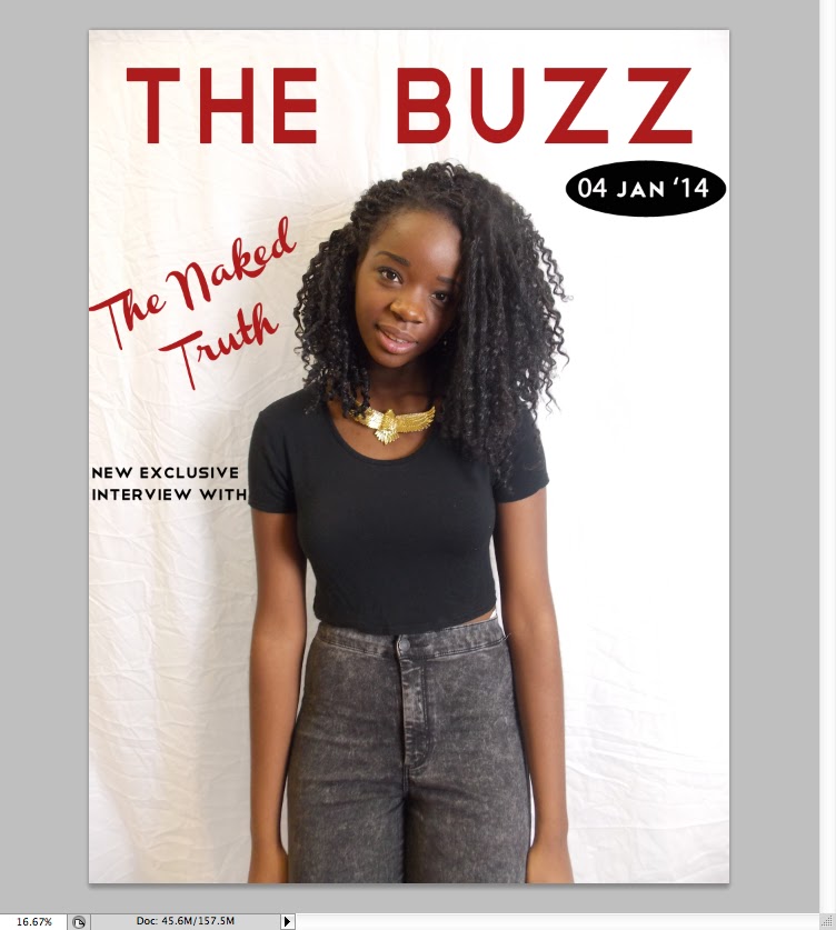
- I then imported my picture onto the file by dragging it into Photoshop. To ensure I always had a back-up copy of my picture I pressed command and then J to make a 'background copy'. To edit my photo I only altered the brightness a little to make the background lighter as usually a plain background is used for the front cover.
- I then added the title and made the text size 181pt to fill the whole top line. I chose my font text as 'Telegrafico' due to it being sans-serif making it more modern; a young, modern image is pivotal in me attracting my young 'Townie' age range and contemporary texts help me achieve this.
- I chose to use the same colour for my double page spread title and title as it makes the magazine look more professional. I did this by using the colour chart to find a dark red/maroon which is not particularly aligned to either sex, meaning I would attract both males and females. For my later texts with the same colour i used the small colour box on the lower left hand side and clicked it after highlighting my text to ensure the same colour was used throughout.
- I then needed to add a date to ensure my reader would know what issue or week the magazine was published. To make the date stand out I put a black shape behind it. I did this by using the shape tool to the left and chose the 'Ellipse Tool' to create my chosen shape. I made the colour black to ensure it did not go against my house style and maintain that it did not overshadow any focus on my picture. I chose the colour by using the colour chart tool and dragged the mouse to the very bottom of the left hand corner to make black.
- I then put the date in. I chose a white colour as it correlated with my house style and stood out against the black background.I used the same font 'Telegrafico' for both the date and the title this is too make the magazine more appealing to the eye and to correlate with my house style.
- I then used the same font for the surrounding text around the picture. I added text my using the 'T' icon on the left hand side and then typing my chosen text, afterwards I altered the colour and size through the bar at the top of the screen. I chose a black text to make the text not too attention-grabbing and used the same font to make the front page gel together better
- The next thing I did was to put the name of my cover artist over the middle, this was to ensure there was not too much white space left on the page and too draw attention to the picture. I initially tried to use the same text, however, it was too small and did not draw enough attention to the artist due to it blending in with the other text.
- I then chose a 'Channel Slanted' font which was bigger and drew more attention to the artist by contrasting with other text due to it being in italics and being serif. It made the magazine look a lot more professional compared to the other text. The text was chosen to be grey to not go too against my house style but also still draw attention to my artist by being a different colour.

- To use up some of the white space I then decided to put a header on the top of the page. I did this by choosing a rectangle shape from th shape icon on the left hand side and then colouring it black. To make it look more interesting I out white text over the top in the same 'Telegrafico' font to correlate with my house style. I chose to write the text as 'new year new issue' to build up excitement for the reader as its the magazine first issue in the new year. However, it looked slightly unbalanced due to nothing being at the bottom, so I put the same header and text to make the page correlate more and have more balance. In the bottom header I left space for a small bar code.


- I then added a bar code into the front cover to make it look more authentic. I achieved this by saving a picture of a barcode, dragging it into Photoshop. I then made a background copy of the picture using command and J to allow me to drag it into the front cover screen. I did this by using the selection tool so it selected the bar cos and then dragging it onto the page and placing it at the bottom. I then added some more text on the side, however, it looked a little bare so I decided to add some bullet points of artists that were featured
- As there is no bullet point tool on Photoshop I did bullet points by writing a full stop in a text box using the 'T' icon on the left hand side. And then enlarging it to make it seem like an actual bullet point. I also made the text smaller to draw attention to the header which is more likely to grab the readers attention.
- To then fill up space on the right hand side I added a picture of the 'V Festival' logo. I did this by saving a picture of it from the internet, dragging it into Photoshop, making a copy of it using buttons command and J and then using the selection tool on the left hand side to drag it onto the front page. I chose this logo a it fit with my colour scheme of red, black and white making my magazine seem more professional.
- To then complete this text I added text underneath in 'Telegrafico' font to correlate with my house style. Moreover, I made the text fit exactly under the logo as it made it seem more professional and looked neater on the page.
- I then added another header in the same font but a bigger text size due to it being a header. I used a rhetorical question as it directly addresses the reader making it more likely to grab their attention.
- My final pieces of text were then added. I chose to include more different colours and text sizes to ensure the readers attention would be caught. Also, it highlights certain words such as popular rap artist 'Drake', meaning the headlines are easier for the audience too see. I used to same colour as in the title for the word 'Update' to ensure house style was correlated, I did this by using the small colour box in the lower left hand corner and clicking ti after highlighting my text. I made the 'Drake' bigger by increasing font size.

- However, I still felt my front cover was slightly bare compared to other music magazines on the market such as, 'Kerrang!'. I solved this by including a pool quote over her body. But to ensure no attention was taken away from her I made the background opaque by using the 'opacity' tool and increasing its opaqueness until I was satisfied. Over this box I then placed text, in a handwriting style to make the quote seem more authentic and grab some of the readers attention. Below is my final front over.


No comments:
Post a Comment