Monday 31 March 2014

Evaluation Question 4

My music genre is chart music meaning it will have a broader target range as chart music is not is such a specific type unlike rock music, for example. However, I do predominantly target my magazine at young individuals from 15-21 ,this is due to this group being the most interested in chart music ,as shown by 67.1% KISS FM’s (a chart music radio station) listeners being 16-21 year old. My audience may be either male or female as I have made my magazine gender-neutral in order to increase potential profit margin. I have 
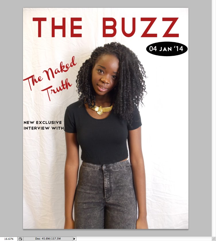
achieved this through using red, a colour not particularly associated with either sex, as the main house colour throughout the magazine. In addition, artists featured on the front cover are the ones dominating the charts, showing how I have kept true to the music genre the magazine represents and what the target audience listen to. Popular artists such as, Drake and Taylor Swift, have a cover line on the front page drawing the target audiences attention to those particular household names

To also attract my target audience of young people I plan to also keep the price low, as from my research I found most weekly music magazines were priced from £2.20-£2.60. Therefore, I will price mine at £2 as it will just be starting so I need to not put off potential buyers by having a higher price on equal with more well-known magazines such as, ‘Kerrang!’Furthermore, most of the people in my target audience will either be at university or have a weekend job, meaning they will not have a vast access to money , therefore, we should keep the price low to maintain that they can afford it. 


Furthermore, my target audience 
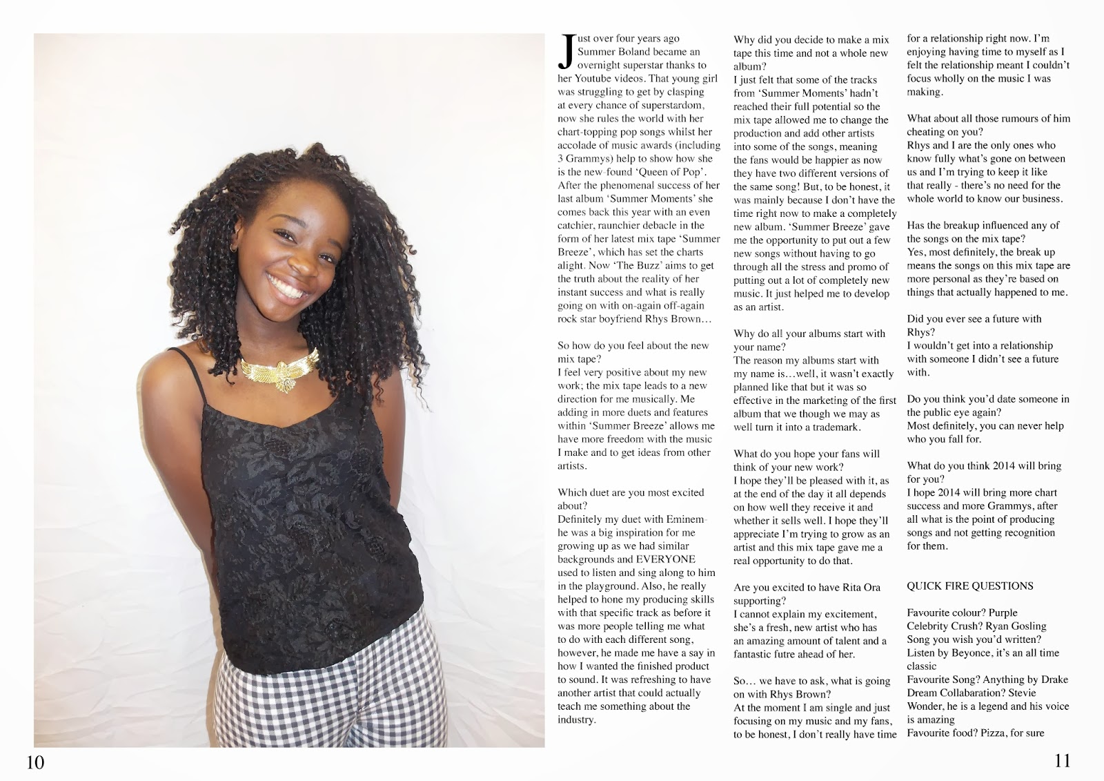
have also been targeted through the clothes featured throughout the magazine. In my research most individuals said they would prefer high street clothing to be worn by the artist. I have achieved this by making both artists featured wear clothing from Topshop, River Island and H&M – shops all mentioned that the target audience went to. This will increase accessibility for the target audience to the magazine as they wil be able to buy the clothes featured. This will help attract them as they will also get a shopping aspect in the music magazine and will be able to relate more to the feature artist as well, hopefully increasing sales. 

Tuesday 25 March 2014

Front Page Construction


  • This is my original page with no picture or text placed on it, I chose to keep the original measurements Photoshop gave me for the page as it was the most realistic shape for the front cover of a music magazine through it being rectangular.


  • I then imported my picture onto the file by dragging it into Photoshop. To ensure I always had a back-up copy of my picture I pressed command and then J to make a 'background copy'. To edit my photo I only altered the brightness a little to make the background lighter as usually a plain background is used for the front cover. 


  • I then added the title and made the text size 181pt to fill the whole top line. I chose my font text as 'Telegrafico' due to it being sans-serif making it more modern; a young, modern image is pivotal in me attracting my young 'Townie' age range and contemporary texts help me achieve this. 


  • I chose to use the same colour for my double page spread title and title as it makes the magazine look more professional. I did this by using the colour chart to find a dark red/maroon which is not particularly aligned to either sex, meaning I would attract both males and females. For my later texts with the same colour i used the small colour box on the lower left hand side and clicked it after highlighting my text to ensure the same colour was used throughout.


  • I then needed to add a date to ensure my reader would know what issue or week the magazine was published. To make the date stand out I put a black shape behind it. I did this by using the shape tool to the left and chose the 'Ellipse Tool' to create my chosen shape. I made the colour black to ensure it did not go against my house style and maintain that it did not overshadow any focus on my picture. I chose the colour by using the colour chart tool and dragged the mouse to the very bottom of the left hand corner to make black.


  • I then put the date in. I chose a white colour as it correlated with my house style and stood out against the black background.I used the same font 'Telegrafico' for both the date and the title this is too make the magazine more appealing to the eye and to correlate with my house style. 


  • I then used the same font for the surrounding text around the picture. I added text my using the 'T' icon on the left hand side and then typing my chosen text, afterwards I altered the colour and size through the bar at the top of the screen. I chose a black text to make the text not too attention-grabbing and used the same font to make the front page gel together better


  • The next thing I did was to put the name of my cover artist over the middle, this was to ensure there was not too much white space left on the page and too draw attention to the picture. I initially tried to use the same text, however, it was too small and did not draw enough attention to the artist due to it blending in with the other text.


  • I then chose a 'Channel Slanted' font which was bigger and drew more attention to the artist by contrasting with other text due to it being in italics and being serif. It made the magazine look a lot more professional compared to the other text. The text was chosen to be grey to not go too against my house style but also still draw attention to my artist by being a different colour. 


  • To use up some of the white space I then decided to put a header on the top of the page. I did this by choosing a rectangle shape from th shape icon on the left hand side and then colouring it black. To make it look more interesting I out white text over the top in the same 'Telegrafico' font to correlate with my house style. I chose to write the text as 'new year new issue' to build up excitement for the reader as its the magazine first issue in the new year. However, it looked slightly unbalanced due to nothing being at the bottom, so I put the same header and text to make the page correlate more and have more balance. In the bottom header I left space for a small bar code. 


  • I then added a bar code into the front cover to make it look more authentic. I achieved this by saving a picture of a barcode, dragging it into Photoshop. I then made a background copy of the picture using command and J to allow me to drag it into the front cover screen. I did this by using the selection tool so it selected the bar cos and then dragging it onto the page and placing it at the bottom. I then added some more text on the side, however, it looked a little bare so I decided to add some bullet points of artists that were featured


  • As there is no bullet point tool on Photoshop I did bullet points by writing a full stop in a text box using the 'T' icon on the left hand side. And then enlarging it to make it seem like an actual bullet point. I also made the text smaller to draw attention to the header which is more likely to grab the readers attention.


  • To then fill up space on the right hand side I added a picture of the 'V Festival' logo. I did this by saving a picture of it from the internet, dragging it into Photoshop, making a copy of it using buttons command and J and then using the selection tool on the left hand side to drag it onto the front page. I chose this logo a it fit with my colour scheme of red, black and white making my magazine seem more professional. 


  • To then complete this text I added text underneath in 'Telegrafico' font to correlate with my house style. Moreover, I made the text fit exactly under the logo as it made it seem more professional and looked neater on the page. 


  • I then added another header in the same font but a bigger text size due to it being a header. I used a rhetorical question as it directly addresses the reader making it more likely to grab their attention.


  • My final pieces of text were then added. I chose to include more different colours and text sizes to ensure the readers attention would be caught. Also, it highlights certain words such as popular rap artist 'Drake', meaning the headlines are easier for the audience too see. I used to same colour as in the title for the word 'Update' to ensure house style was correlated, I did this by using the small colour box in the lower left hand corner and clicking ti after highlighting my text. I made the 'Drake' bigger by increasing font size. 


  • However, I still felt my front cover was slightly bare compared to other music magazines on the market such as, 'Kerrang!'. I solved this by including a pool quote over her body. But to ensure no attention was taken away from her I made the background opaque by using the 'opacity' tool and increasing its opaqueness until I was satisfied. Over this box I then placed text, in a handwriting style to make the quote seem more authentic and grab some of the readers attention. Below is my final front over. 


Monday 17 March 2014

Final Double Page Spread

This is my final double page spread, I chose to continue with the colour scheme of red, white and black to emphasise my house style and make the magazine continuous for the reader. Moreover, to continue with the house style that is often seen within other magazine such as NME, which places its logo at the end of each page, I used the same 'The Buzz Weekly Edition' used on my contents page. This makes my double page spread look more professional as it correlates with other magazines. I chose the drop shadow effect on specific lines in the double page spread as these effects also make the page look more professional as these page or text effects are often seen in music magazines as they add interest to the page. To make the magazine correlate I used some of the same texts I had formerly used in the front and contents page, this text was 'Channel Slanted'. I chose this text as it was an italic style but still looked modern, reflecting the modern chart music my magazine features. Th text is used in places where I want attention to be drawn such as , the pool quote which dominates the right page.I also used this text on her name on the left page, this was to highlight her name so the reader is still aware of who is featured. I chose to include this section as the page looked plain without it and it is often featured on other magazines when there is a lot of background left after the picture has been placed as it fills up space. The picture was chosen as I think it shows a different side to my feature artist as on the front cover she has a stern expression and looks more posed, whereas this shot appears more natural due to her smiling and having relaxed body language.

Wednesday 12 March 2014

Further Double Page Spread Research


These double page spreads had the most influence on my designing my own double page spreads. This is due to them correlating with my colour scheme of red, black and white but also appearing sleek and modern. This is achieved through their neat layout and design elements such as using different, contrasting types of text. I was also fond of the pictures used as I felt they stood out well and enticed the reader in through their pose or what they were wearing.

Double Page Spread Draft


Tuesday 11 March 2014

Contents Page Research


I have chosen this magazine as it is based on the charts, meaning it will be more useful when planning how my contents page will look as I want my page to correlate with other magazines of the same genre.  On the upper left hand corner the logo of the magazine is placed. This helps to continue the house style of the magazine through appearing more consistent as the magazine title is implemented on all pivotal pages. The readers are also reminded of the magazines title, making it more memorable. Consistency is also developed through there being a clear colour scheme implemented on the contents page. The colours are blue, black and yellow – all eye-catching colours attracting the reader’s attention and ma
king the page hard to ignore. An organized layout is displayed through there being a clear layout of three columns, this is to make it easier for the reader to direct themselves to the pages they want to see in the magazine. Each section is also separated by sub-headings making the magazine layout clearer. To add interest and make the page more appealing to the eye a variety of pictures have been included. Moreover, not only one artist is featured but several making the page more interesting as the reader gains a further insight into other features. A chart table is also placed to the left of the page making the reader fully aware of the genre the magazine uses. It also adds interest to the page by giving the reader something interesting to read already. The title of the page ‘Contents’ dominates the page, meaning the reader knows what exactly what page they are on. It also adds interest to the page and makes it more eye-appealing as the title has design features placed on it.

Double Page Flat Plans


I like my plans, however, I prefer the second one as there is less white space and I feel the title looks better when it is not slanted due to it having more precendence on the page and probably allowing it to be bigger.

Further Double Page Spread Research


Monday 10 March 2014

Double Page Spread Research


All of the left hand side is taken over by a picture of the artist, meaning she is a dominant feature of the article. I like this as it means the article is more eye-catching and the reader is drawn in more. The picutre is a mid-shot , however, seems more like a close up as her face is the focus of the picture due to having heavy makeup and large, volumnous hair meaning the reader's attention is instantly drawn to it. There is a white background which is continued through both pages. This is a feature I like a lot as it looks better than having two different colours as a background on each page, as seen on a lot of double page spreads where the background of the picture is a different colour to the text. I would like to include this in my own double page spread as I feel it makes it look more professional and the pages blend better together.


This is another article I think is very effective and has a great presence due to being so eyecatching. The colour scheme in this article is effectively used due to black, white and red all going together well making the page look very professional. Moreover, the red design elements on the page mean that certain areas of text are highlighted such as, 'The brother I wanted to smother', making the reader automatically be drawn to them and creating interest.The bold colours used compliment and reflect the bold picture of Joe Jonas, meaning the article has a greater impact as everything stands out. However, I do believe a larger text or drops cap at the start would have made the text stand out more against the red design element and would have made the article look better.  


Although this magazine does not fit into my music genre I felt it was important to research other types of double page spreads to get the best feel of how to present my work and get other ideas. I think the picture is well taken and fits well with its chosen genre, something I hope to emulate in my own double page spread. It fits well within its rock genre due to artists being dressed in dark clothing and there is gritty, relaistic background of docks and ships. Whereas, in pop music magazines the background is often white and the pictures are often taken at a studio not on location. I think the pages blens well together due to contuining the background between both pages. Additionally, the colours on the page , blue, black and white also fit well into the genre through not appearing girly but also the colours compliment the picture by reflecting the unpolished, gritty feel of the photograph. The title 'Young Rebel Set' is modern and young through being sans-serif, something I hope to emulate. However, I do not like how the title is so much smaller that the actual title fo the  magazine. I feel it does not make the article as eye-catching and the reader would not be fully drawn to it.

From this research I feel I have been able to conclude what styles I like for my double page spread.I have found I prefer to have a picture just on one side and a larger title as I feel it is more eye-catching. The double page spread that was my favourtie was the Lady Gaga one as I feel it is the most modern and I feel the black, white and red colour scheme works really well. 


Thursday 6 March 2014

Feedback

A year 13 student reviewed by earlier work and wrote down some suggestions to improve my work:

They stated that my positive on my front cover and contents page were that the pictures were well taken, good fonts and headers. However, there were some improvements such as: it needing more cover lines, too many colours, it looking like a spreadsheet and too much white space.
Improvements:
I added more cover lines to get rid of empty space on my front page.
I felt that more text on the top would make the page look more crowded so I added more text on my headline concerning Rita Ora and wrote down what album reviews were included in the magazine. This filled up space, making my page look more professional and adhered to their improvements.
To then make my contents page look less like a spreadsheet and fill in white space I added underlines to my titles and made the borders around my pictures thicker and pictures bigger. This makes my page look fuller and , therefore, more aesthetically pleasing.
For my double page spread the individual said to put a headline or quote on my picture to help fill up space. I will shows you how I did this in the video below.


As I had already added the text to the left side of the picture, I decided to not include the quote at the side as I felt it made the piece look too crowded. However, I did adhere to their advice by adding text to the photograph on the bottom left hand side.
To add interest to my double page spread but not clog it up by putting on another quote or headline on I decided to change the colour of some text.