Sunday, 20 April 2014

Friday, 4 April 2014
Final Front Cover and Contents Page


I feel I made good progress on both of these areas due to learning more about layout, text and photography. Layout was a key part of this as my earlier pieces often had a lot of white, unused space. However, with these pieces I learned where to add more text to fill in spaces and to make pictures bigger and bolder to detract attention away from those empty areas.Additionally, the layout was something I had to work on as often my work was not balanced. I solved this by sticking to a strict column system in both pieces of work. In addition, I felt I have implemented a house style, something I struggled on before, by sticking to a colour scheme, using the same fonts and through small design details such as , including 'The Buzz, Weekly Edition, at the bottom of each inside page.Moreover, my skills in photography have improved through using a more appropriate model compared to my first photoshoot and directing the models in the best way to pose.
Contents Page Construction

- I made my contents page in Photoshop. This is due to it being easy to edit and manipulate text and pictures without much difficulty.

- After making a background copy by pressing command J,to ensure I always had a backup, I then put in my title. I did this by pressing the text icon at the side and making a new textbox. I then typed my text in. I wanted to make the title one of the main focuses of the page to ensure the reader knew where they were. To achieve this I made the text 45pt in Telegrafico. I chose a text that had already been used on the front cover to maintain a strong house style.

- I then placed a picture in of a different artist to the one on the front cover. I did this because in my research I noticed most music magazines contents page featured a number of different artist, not just the artist featured on the front page. I added the artist in my dragging her into Photshop on a different window. I then made background copy of the picture by pressing command and J. This background copy was then dragged onto my actual contents cover page and placed where I wanted it.

- The picture was too dark for the contents page. I solve this my clicking its layer and then going onto the brightness and contrast button at the top. I then altered the brightness and contrast until I was satisfied by sliding the tabs along the bar until it was bright enough.

- To make my magazine feel more edgy and modern I decided I wanted the pictures on the contents page to be black and white. To do this I clicked onto the picture layer on the tab and then, once it was highlighted, I clicked the black and white tab to make the picture black and white. I made sure the black and white layer was placed above the picture layer on the chart so it would overrule the original colour of the photograph.

- I then added in my other pictures and made them black and white using the techniques prior mentioned.

- To make the contents page look more professional I added design elements of borders around the pictures. This would also help draw attention to the pictures, which tend to be a main focus of the contents page as my research shows. I did this by pressing the line icon on the far left of my screen and making a line of the correct length and weight by dragging the pointers and the end and middle of the rectangle. To colour the shape I used the small colour box on the bottom far left colour and chose a dark red with the same colour settings as the red on the front cover. This is to implement my house style, whilst the red contrasting with the black and white contributes to the young, modern feel making the magazine more attractive to my young target audience of 'Townies'.

- I then continued to put lines across all the borders of the pictures to complete the effect using the aforementioned techniques

- I then put another line across the upper right hand corner to add another design element. I planned to put the issue number across this banner to make the reader aware of how many issues were , and in my research I noticed a lot of magazines placed what issue number that magazine was. However, I did not want it to be a main focus of the page only a subtle piece on the page. To achieve this I clicked onto its layer then , once it was highlighted, clicked onto the opacity tab on the hart and decreased its opacity until it was faded. This would ensure it did not gain much attention.

- I then added the text by making a new text box through clicking to text icon on the far left side then typing in my text. To make it slanted , I licked the adjuster button in the middle of the text box and turned it sideways until it fitted inside the banner. I made sure the texts layer was beneath the rectangle shapes layer this made it have a faded look , which again ensured it did not stand out too much and made it look more professional.

- I then realised the large white space at the inner corner of the banner to cover this up I placed another picture of my front cover in the corner. I did this by opening my front cover onto Photoshop on a different window , making a background copy by pressing command and J, then dragging that copy into the contents page using the selection tool on the far right side to select the picture. The next step is to resize the picture to make it small as the picture is its original size meaning it covers the whole page. I did this by pressing command and t whilst holding shift and then dragging it to the size I wanted. Once it was set I then clicked 'apply transformation' on the pop up box. I pressed shift throughout to ensure the picture remained in proportion. To make it appear behind the banner I moved the layer below the text and banner so it would not hold precedence over them.

- I then began to add my text into the page. I chose to make heading in 'Channel Slanted' font and continue with a red colour to make a solid house style throughout my magazine. I changed the font by highlighting my chosen text then clicking on the font tab and scrolling through it until I found my specific text. I then clicked this and my text font was changed.

- I then put in my lower text which would title the headlines featured. I made this text smaller so the title would grab the most attention. To make the magazine easier to get around I put page numbers by the article. I put the page number in a seperate layer and text box to the text so they would be easier to move around and I could alternate my page more easily if necessary.

- To create interest for some articles I decided to put a bit of text below with rhetorical question or phrases creating excitement so the reader would feel more intrigued to read the magazine. I did this by making a new text box using the 'T' icon on the far left side and then typing my text in. I kept the font as 'Telegrafico' to maintain a strong house style as this was a font that was also used on my front cover. I also felt it had a modern feel due to being sans-serif and in a simple style

- I then put my remaining text for other features along the column, I noticed with my research that most magazines used three columns for their contents page to give it a more organised appearance. I ensured that I kept to a column appearance through putting a grid on the background so I could see clearly whether things were in line. I did this by clicking the 'Options' tab at the top of the screen and clicking on 'Extras'.

- Using the same technique I put in the rest of my text, leaving space for my chart table to be placed on the right hand side.

- I then put in my chart table to make my contents page more interesting and related to my chosen music genre. I did this by making the table in Word, I then highlighted the table and dragged it into a different window on Photoshop. I then made a background copy of it by pressing down Command and J. I then dragged this background copy into the contents page by pressing the selection tool at the far left side and selecting the box and dragging it.

- However, when I had highlighted the table on Word it was not able to highlight one borderline on the left side. To make the border line again I pressed the line tool on the left side and drew out a line of the same height and thickness of the other one using the pointers at the end and middle of the rectangle. This made my page look more professional as now both sides matched.

- I wanted to fill the white space above the table by putting in a title for the table. I chose to use the 'Channel Slanted' text again as it would maintain my house style by blending in with my headers and front cover. Moreover, I made this text big with a 19.55 pt text so it would draw attention to the table and help to fill the white space.

- In my research I noted that on the pictures featured on the contents page a page number for which they were featured on was placed at the side of the picture. This was to make it even easier for the reader to navigate to the main features in the magazine. To do this I made a text box using the 'T' icon at the side of the page and then typed my text. I again made the font 'Channel Slanted' to continue with my house style and I felt the font suited the picture the most as it was still modern but added detail to it by being slanted. I kept the colour the same by highlighting my text then colouring it red by using the small colour box at the lower left side.

- To keep my magazine modern and keep with usual magazine tactics to maintain a strong brand through franchising into the internet I added a website and Twitter hashtag which readers could easily access. I did not want this to be a main focus so I only made it 8pt and placed it in the corner. I did this by making a new text box by clicking to 'T' icon and then typing my text into the text box.

- I wanted to strengthen the house style to increase the branding of the magazine to make it more noticeable to the reader as so far only texts and a colour scheme had been used to implement a house style. I did this by deciding to make a footer at the bottom of each inside page of the magazine. I did this by drawing a line using the line tool across the bottom of the page, then colouring it in using the small colour box on the left hand side to make it the same red.

- I then added text on the bottom and the top in the font Telegrafico as this had already been used on both my front and contents page so would help to continue the front page. I felt it also made the page look more professional due to it being a little detail that would often be included in other magazines.

- To fill in the white space to make my page more professional I added lines under all titles. I did this by clicking on the 'T' icon, making a text box and then typing in a full stop. I then enlarged this by clicking the text size bar at the top and scrolling to the size font I wanted which was 30pt for the main title and 10pt for the smaller headlines.

- My final contents page
Double Page Spread Construction
The first video is of my designing my article on inDesign, whereas, the second video is of me editing my photograph.
Monday, 31 March 2014
Evaluation Question 4
My music genre is chart music meaning it will have a broader
target range as chart music is not is such a specific type unlike rock music,
for example. However, I do predominantly target my magazine at young
individuals from 15-21 ,this is due to this group being the most interested in
chart music ,as shown by 67.1% KISS FM’s (a chart music radio station) listeners
being 16-21 year old. My audience may be either male or female as I have made my
magazine gender-neutral in order to increase potential profit margin. I have
achieved this through using red, a colour not particularly associated with
either sex, as the main house colour throughout the magazine. In addition,
artists featured on the front cover are the ones dominating the charts, showing
how I have kept true to the music genre the magazine represents and what the
target audience listen to. Popular artists such as, Drake and Taylor Swift, have a cover line on the front page drawing the target audiences attention to those particular household names
To also attract my target
audience of young people I plan to also keep the price low, as from my research
I found most weekly music magazines were priced from £2.20-£2.60. Therefore, I
will price mine at £2 as it will just be starting so I need to not put off
potential buyers by having a higher price on equal with more well-known
magazines such as, ‘Kerrang!’Furthermore, most of the people in my target audience will either be at university or have a weekend job, meaning they will not have a vast access to money , therefore, we should keep the price low to maintain that they can afford it.
Furthermore, my target audience
have also been targeted through the clothes featured throughout the magazine.
In my research most individuals said they would prefer high street clothing to
be worn by the artist. I have achieved this by making both artists featured
wear clothing from Topshop, River Island and H&M – shops all mentioned that
the target audience went to. This will increase accessibility for the target audience to the magazine as they wil be able to buy the clothes featured. This will help attract them as they will also get a shopping aspect in the music magazine and will be able to relate more to the feature artist as well, hopefully increasing sales.
Tuesday, 25 March 2014
Front Page Construction

- This is my original page with no picture or text placed on it, I chose to keep the original measurements Photoshop gave me for the page as it was the most realistic shape for the front cover of a music magazine through it being rectangular.

- I then imported my picture onto the file by dragging it into Photoshop. To ensure I always had a back-up copy of my picture I pressed command and then J to make a 'background copy'. To edit my photo I only altered the brightness a little to make the background lighter as usually a plain background is used for the front cover.

- I then added the title and made the text size 181pt to fill the whole top line. I chose my font text as 'Telegrafico' due to it being sans-serif making it more modern; a young, modern image is pivotal in me attracting my young 'Townie' age range and contemporary texts help me achieve this.

- I chose to use the same colour for my double page spread title and title as it makes the magazine look more professional. I did this by using the colour chart to find a dark red/maroon which is not particularly aligned to either sex, meaning I would attract both males and females. For my later texts with the same colour i used the small colour box on the lower left hand side and clicked it after highlighting my text to ensure the same colour was used throughout.

- I then needed to add a date to ensure my reader would know what issue or week the magazine was published. To make the date stand out I put a black shape behind it. I did this by using the shape tool to the left and chose the 'Ellipse Tool' to create my chosen shape. I made the colour black to ensure it did not go against my house style and maintain that it did not overshadow any focus on my picture. I chose the colour by using the colour chart tool and dragged the mouse to the very bottom of the left hand corner to make black.

- I then put the date in. I chose a white colour as it correlated with my house style and stood out against the black background.I used the same font 'Telegrafico' for both the date and the title this is too make the magazine more appealing to the eye and to correlate with my house style.
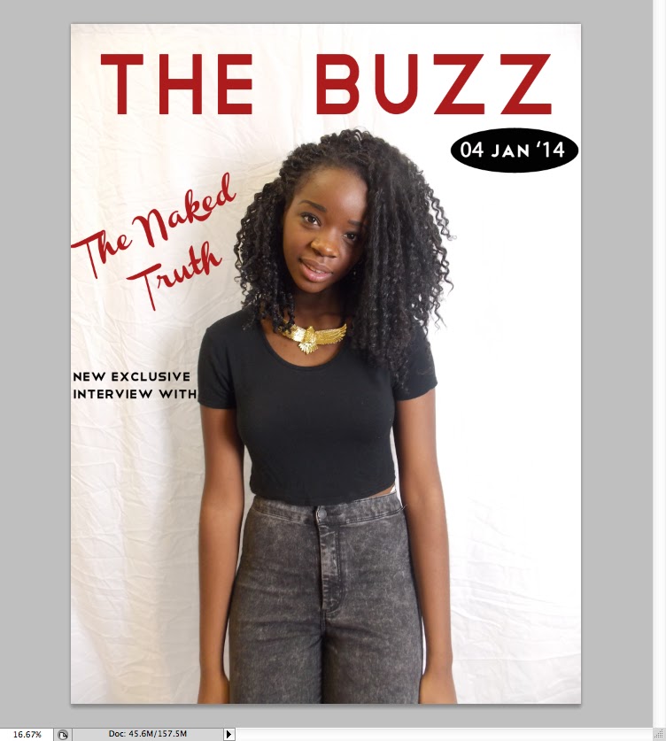
- I then used the same font for the surrounding text around the picture. I added text my using the 'T' icon on the left hand side and then typing my chosen text, afterwards I altered the colour and size through the bar at the top of the screen. I chose a black text to make the text not too attention-grabbing and used the same font to make the front page gel together better

- The next thing I did was to put the name of my cover artist over the middle, this was to ensure there was not too much white space left on the page and too draw attention to the picture. I initially tried to use the same text, however, it was too small and did not draw enough attention to the artist due to it blending in with the other text.

- I then chose a 'Channel Slanted' font which was bigger and drew more attention to the artist by contrasting with other text due to it being in italics and being serif. It made the magazine look a lot more professional compared to the other text. The text was chosen to be grey to not go too against my house style but also still draw attention to my artist by being a different colour.

- To use up some of the white space I then decided to put a header on the top of the page. I did this by choosing a rectangle shape from th shape icon on the left hand side and then colouring it black. To make it look more interesting I out white text over the top in the same 'Telegrafico' font to correlate with my house style. I chose to write the text as 'new year new issue' to build up excitement for the reader as its the magazine first issue in the new year. However, it looked slightly unbalanced due to nothing being at the bottom, so I put the same header and text to make the page correlate more and have more balance. In the bottom header I left space for a small bar code.


- I then added a bar code into the front cover to make it look more authentic. I achieved this by saving a picture of a barcode, dragging it into Photoshop. I then made a background copy of the picture using command and J to allow me to drag it into the front cover screen. I did this by using the selection tool so it selected the bar cos and then dragging it onto the page and placing it at the bottom. I then added some more text on the side, however, it looked a little bare so I decided to add some bullet points of artists that were featured

- As there is no bullet point tool on Photoshop I did bullet points by writing a full stop in a text box using the 'T' icon on the left hand side. And then enlarging it to make it seem like an actual bullet point. I also made the text smaller to draw attention to the header which is more likely to grab the readers attention.

- To then fill up space on the right hand side I added a picture of the 'V Festival' logo. I did this by saving a picture of it from the internet, dragging it into Photoshop, making a copy of it using buttons command and J and then using the selection tool on the left hand side to drag it onto the front page. I chose this logo a it fit with my colour scheme of red, black and white making my magazine seem more professional.

- To then complete this text I added text underneath in 'Telegrafico' font to correlate with my house style. Moreover, I made the text fit exactly under the logo as it made it seem more professional and looked neater on the page.

- I then added another header in the same font but a bigger text size due to it being a header. I used a rhetorical question as it directly addresses the reader making it more likely to grab their attention.

- My final pieces of text were then added. I chose to include more different colours and text sizes to ensure the readers attention would be caught. Also, it highlights certain words such as popular rap artist 'Drake', meaning the headlines are easier for the audience too see. I used to same colour as in the title for the word 'Update' to ensure house style was correlated, I did this by using the small colour box in the lower left hand corner and clicking ti after highlighting my text. I made the 'Drake' bigger by increasing font size.

- However, I still felt my front cover was slightly bare compared to other music magazines on the market such as, 'Kerrang!'. I solved this by including a pool quote over her body. But to ensure no attention was taken away from her I made the background opaque by using the 'opacity' tool and increasing its opaqueness until I was satisfied. Over this box I then placed text, in a handwriting style to make the quote seem more authentic and grab some of the readers attention. Below is my final front over.

Monday, 17 March 2014
Final Double Page Spread

Subscribe to:
Posts (Atom)