Wednesday, 12 March 2014
Further Double Page Spread Research
These double page spreads had the most influence on my designing my own double page spreads. This is due to them correlating with my colour scheme of red, black and white but also appearing sleek and modern. This is achieved through their neat layout and design elements such as using different, contrasting types of text. I was also fond of the pictures used as I felt they stood out well and enticed the reader in through their pose or what they were wearing.

Tuesday, 11 March 2014
Contents Page Research

I have chosen this magazine as it is based on the charts,
meaning it will be more useful when planning how my contents page will look as
I want my page to correlate with other magazines of the same genre. On the upper left hand corner the logo of the
magazine is placed. This helps to continue the house style of the magazine
through appearing more consistent as the magazine title is implemented on all
pivotal pages. The readers are also reminded of the magazines title, making it
more memorable. Consistency is also developed through there being a clear
colour scheme implemented on the contents page. The colours are blue, black and
yellow – all eye-catching colours attracting the reader’s attention and ma
king
the page hard to ignore. An organized layout is displayed through there being a
clear layout of three columns, this is to make it easier for the reader to
direct themselves to the pages they want to see in the magazine. Each section
is also separated by sub-headings making the magazine layout clearer. To add
interest and make the page more appealing to the eye a variety of pictures have
been included. Moreover, not only one artist is featured but several making the
page more interesting as the reader gains a further insight into other
features. A chart table is also placed to the left of the page making the
reader fully aware of the genre the magazine uses. It also adds interest to the
page by giving the reader something interesting to read already. The title of
the page ‘Contents’ dominates the page, meaning the reader knows what exactly
what page they are on. It also adds interest to the page and makes it more
eye-appealing as the title has design features placed on it.
Double Page Flat Plans


Monday, 10 March 2014
Double Page Spread Research


This is another article I think is very effective and has a great presence due to being so eyecatching. The colour scheme in this article is effectively used due to black, white and red all going together well making the page look very professional. Moreover, the red design elements on the page mean that certain areas of text are highlighted such as, 'The brother I wanted to smother', making the reader automatically be drawn to them and creating interest.The bold colours used compliment and reflect the bold picture of Joe Jonas, meaning the article has a greater impact as everything stands out. However, I do believe a larger text or drops cap at the start would have made the text stand out more against the red design element and would have made the article look better.

Although this magazine does not fit into my music genre I felt it was important to research other types of double page spreads to get the best feel of how to present my work and get other ideas. I think the picture is well taken and fits well with its chosen genre, something I hope to emulate in my own double page spread. It fits well within its rock genre due to artists being dressed in dark clothing and there is gritty, relaistic background of docks and ships. Whereas, in pop music magazines the background is often white and the pictures are often taken at a studio not on location. I think the pages blens well together due to contuining the background between both pages. Additionally, the colours on the page , blue, black and white also fit well into the genre through not appearing girly but also the colours compliment the picture by reflecting the unpolished, gritty feel of the photograph. The title 'Young Rebel Set' is modern and young through being sans-serif, something I hope to emulate. However, I do not like how the title is so much smaller that the actual title fo the magazine. I feel it does not make the article as eye-catching and the reader would not be fully drawn to it.
From this research I feel I have been able to conclude what styles I like for my double page spread.I have found I prefer to have a picture just on one side and a larger title as I feel it is more eye-catching. The double page spread that was my favourtie was the Lady Gaga one as I feel it is the most modern and I feel the black, white and red colour scheme works really well.
Thursday, 6 March 2014
Feedback
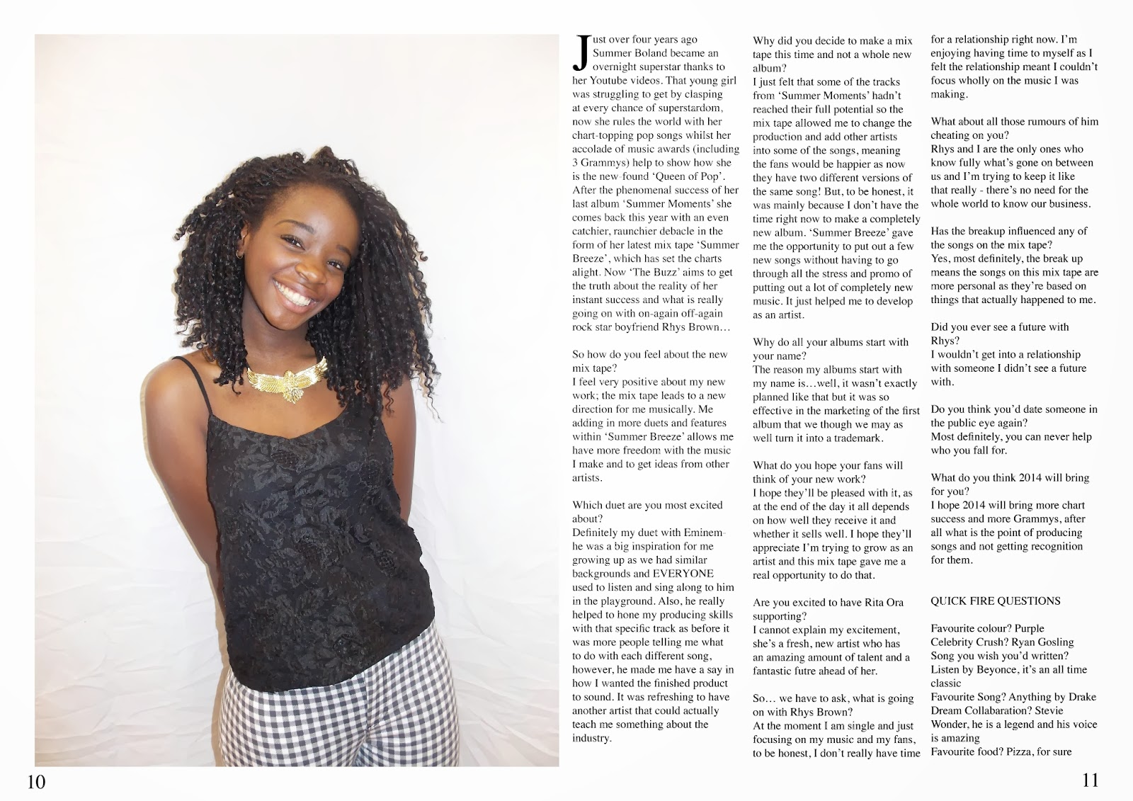
A year 13 student reviewed by earlier work and wrote down some suggestions to improve my work:


They stated that my positive on my front cover and contents page were that the pictures were well taken, good fonts and headers. However, there were some improvements such as: it needing more cover lines, too many colours, it looking like a spreadsheet and too much white space.
Improvements:
I added more cover lines to get rid of empty space on my front page.


They stated that my positive on my front cover and contents page were that the pictures were well taken, good fonts and headers. However, there were some improvements such as: it needing more cover lines, too many colours, it looking like a spreadsheet and too much white space.
Improvements:
I added more cover lines to get rid of empty space on my front page.
I felt that more text on the top would make the page look more crowded so I added more text on my headline concerning Rita Ora and wrote down what album reviews were included in the magazine. This filled up space, making my page look more professional and adhered to their improvements.
To then make my contents page look less like a spreadsheet and fill in white space I added underlines to my titles and made the borders around my pictures thicker and pictures bigger. This makes my page look fuller and , therefore, more aesthetically pleasing.


As I had already added the text to the left side of the picture, I decided to not include the quote at the side as I felt it made the piece look too crowded. However, I did adhere to their advice by adding text to the photograph on the bottom left hand side.
To add interest to my double page spread but not clog it up by putting on another quote or headline on I decided to change the colour of some text.
For my double page spread the individual said to put a headline or quote on my picture to help fill up space. I will shows you how I did this in the video below.
As I had already added the text to the left side of the picture, I decided to not include the quote at the side as I felt it made the piece look too crowded. However, I did adhere to their advice by adding text to the photograph on the bottom left hand side.
To add interest to my double page spread but not clog it up by putting on another quote or headline on I decided to change the colour of some text.
Subscribe to:
Posts (Atom)